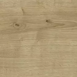
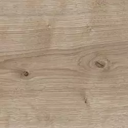
Kitchen Manhattan 48S
SEE THE KITCHEN MATERIALS
OPT FOR THIS DESIGN FOR A NATURAL-LOOKING KITCHEN
This kitchen, adorned with a white color scheme, is highlighted by extensive, consistent wooden elements. The combination of contrasting surfaces and materials gives this kitchen its distinctive, organic radiance.
REASONS TO LOVE THIS PLANNING EXAMPLE
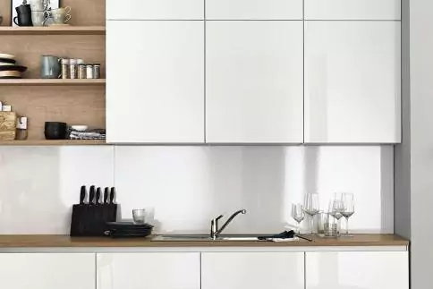
Harmonizing recess panelling and front decors
The dominance of the wooden fronts extending along the walls with almost no interruption is a key feature of this kitchen. It’s simple, yet remarkably eye-catching!
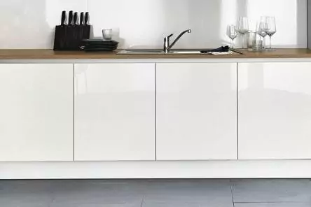
Sophistication everywhere: The MatrixArt finger-pull
The continuous finger-pull is another integral part of the sophisticated design of this kitchen. Upon request, it can even be fitted with a lighting fixture.
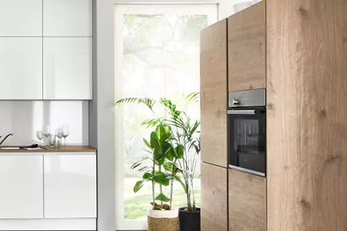
Clean lines across all directions
The built-in MatrixArt finger pulls stretch horizontally and vertically across the kitchen.
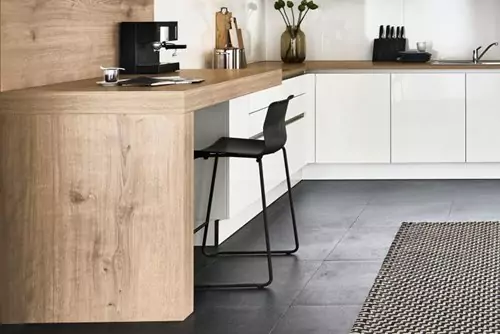
An incorporated bar counter
The seamless transition from bar counter to kitchen forms a subtly charming spot for enjoying your morning meal. Or consider using this space for work occasionally in your kitchen.

